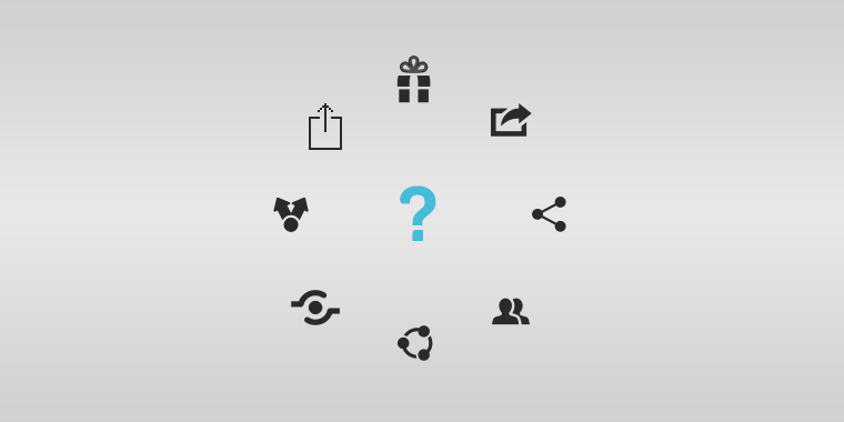
Have you ever tried to share media on your phone, tablet, or online, and come across a different looking share icon image on every platform? Min Ming Lo of Pixelapse brings up that very point in a recent post.
It’s quite interesting, if you think about it. The idea of the “share” icon is very difficult to portray, which is why it takes so many forms. From a Y shape, to a picture of a milkshake, the look of this icon is clearly disagreed upon. It’s quite easy to depict “add” with a + or “back” with an arrow, but “share” requires a little creativity. There’s actually some fascinating approaches, as Ming shows:
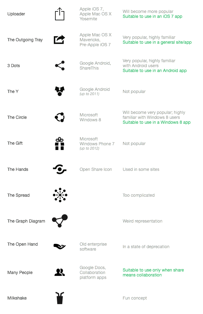
Ming mentions that you likely won’t see the diversity of share icons condense or become universal anytime soon, due to such big companies like Microsoft, Google, and Apple all controlling markets using their own interpretations, keeping everything at a standstill.
What do you prefer? Is there a “share” icon idea that you have that hasn’t been used? Share your thoughts, and be sure to read Ming’s full article here.