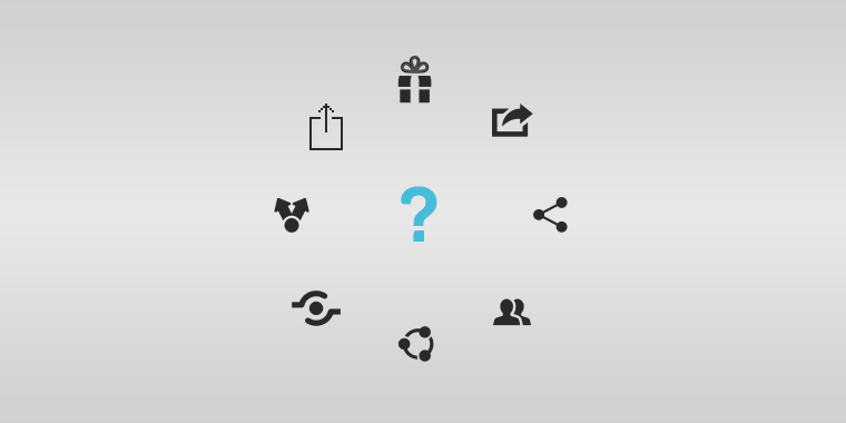
Have you ever tried to share media on your phone, tablet, or online, and come across a different looking share icon image on every platform? Min Ming Lo of Pixelapse brings up that very point in a recent post.
It’s quite interesting, if you think about it. The idea of the “share” icon is very difficult to portray, which is why it takes so many forms. From a Y shape, to a picture of a milkshake, the look of this icon is clearly disagreed upon. It’s quite easy to depict “add” with a + or “back” with an arrow, but “share” requires a little creativity. Continue reading “The Many Faces of the Share Icon”